

Image Conventions
Summary
Understanding of Asset placement on pages and asset HTML presentation is crucial to saving effort for Authors and limiting the amount of manual image manipulation that would otherwise be required.
Introduction
Images are vital to great content; the ability to add images to content as well as for presentation is essential as it provides the ability to differentiate your content. Authoring ability to leverage the same Asset in a different location without additional work is crucial to authoring activities. Authors need to spend more time creating content and rely on DLS and CMS to provide the heavy lifting of Asset presentation.
Asset renditions are versions of an asset in a specific aspect ratio. Generating and caching Asset renditions provides substantial performance improvements as well as predictable capacity planning. This process starts at the Design Language System (DLS) that must set these guidelines and follow them throughout all components. These conventions must be understood by all designers, developers and all content authors, as these conventions will save a lot of effort for all involved.
Authors must be encouraged to upload the highest resolution images into DAM. This allows DAM workflows to use the original image for generating smaller renditions. As assets are uploaded to DAM a workflow is executed, and relevant renditions are generated and stored alongside the original image in DAM. The original image is restricted in its usage, due to obvious size implications, and is only displayed when renditions are missing.
Image Restrictions
The full list of supported asset types can be found at https://helpx.adobe.com/experience-manager/6-4/assets/using/assets-formats.html.
Generally, most image formats are supported by AEM and will work with the rendition workflows to create the various rendition sizes listed below. Any caveats are listed here.
SVGs
SVGs should be treated as special cases as they are best suited to logos and icons, rather than photos. Because they are vector-based, rather than rasterised, SVG’s can be scaled up or down without loss of quality. Further details can be found at https://en.wikipedia.org/wiki/Scalable_Vector_Graphics.
SVG’s can be uploaded to the AEM DAM, and it will generate renditions, but this should be considered an edge case. The use of SVG’s should be limited to special cases such as logos and icons that are integrated into the site via code, rather than being added as a background image through the component authoring tools.
To further complicate matters, due to SVG’s being XML files, they can contain optional XML elements which are not supported by AEM and will cause the image rendition workflow to fail, rendering the image unusable in AEM.
So far the following elements have been identified:
- <linearGradient>
Rendition Sizes
Following is reference image rendition sizes
| Rendition Name | Dimensions (width x height) | Dimensions - Retina | Responsive Media Query | Notes |
|---|---|---|---|---|
| 4K (UHD) | 3840 x 2160 | No image available | 3840=(min-width: 3840px) | Retina image requires the original source image to be 8K |
| 2K (QHD) | 2560 x 1440 | No image available | 2560=(min-width: 2560px) and (max-width: 3839px) | Retina image requires the original source image to be 5K |
| Widescreen (HD) | 1920 x 1080 | Use 4K (UHD) non retina rendition | 1920=(min-width: 1920px) and (max-width: 2559px) | Retina image requires the original source image to be 4K |
| Extra Large | 1792 x 1008 | 3584 x 2016 | 1792=(min-width: 1792px) and (max-width: 1919px) | Retina image requires the original source image to be 4K |
| Large | 1280 x 720 | Use 2K (QHD) non retina rendition | 1280=(min-width: 1280px) and (max-width: 1791px) | Retina image requires the original source image to be at least 2K |
| Medium | 896 x 504 | Use Extra Large non retina rendition | 896=(min-width: 896px) and (max-width: 1279px) | |
| Standard (wide) | 640 x 360 | Use Large non retina rendition | 640=(min-width: 640px) and (max-width: 895px) | |
| Standard | 512 x 288 | 1024 x 576 | 512=(min-width: 512px) and (max-width: 639px) | |
| Small | 384 x 216 | 768 x 432 | 384=(max-width: 511px) | |
| Small (low res) | 256 x 144 | Use the same non-retina version | Set 30% jpeg compression quality. To be used for lazy loading. |
AEM Rendition Considerations
There are a few limitations to AEMs image rendition creation that is worth being aware of:
- It is not possible to generate a rendition which is larger than the original image. For example, if you upload an image which is 1280x720 (Large rendition), it will not generate any of the renditions which are bigger than this (e.g. Extra Large rendition)
- For images which are not of a 16:9 aspect ratio, the image height is the dimension which maps to that set by the rendition. For example, the Standard rendition (which is set to 512x288) could become 431x288, where 288 is the same height as that specified by the rendition height, but the width changes to 431 rather than 512 so the image is not stretched/squashed.
- If the maximum rendition size is increased, this size will need to be reflected in the OSGI config Day CQ DAM Buffered Image Cache. This can be set by an admin directly on the environments via /system/config/configMgr and should also be updated in the code repo.
File Size Considerations
As a reference for helping plan storage disk capacity:
- 1 sample 4K (3840 x 2160) 16:9 image which was originally 1.1MB in size takes up 4.8MB of disk space and consists of 18 image files (1 original and 17 rendition images).
Component Image Map
Images, when added to components as the background will need to scale to match container for the image. Larger images are selected based on the type of device which is specified using a media query.
Images, when placed into a card as an action image representing content, have a specific size that is defined in DLS, image container is smaller in size and dimension than the image. In this situation, a smaller image is selected based on the type of device which is specified using a media query.
Background - Tall
Tall background applies to tall page headers.
| Breakpoint | Dimensions | Rendition | Focal Point Overlay | Notes |
|---|---|---|---|---|
| Desktop (UHD) | 3840 x 600 | 4K (UHD) | 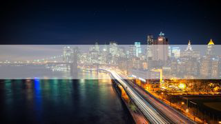 |
|
| Desktop (QHD) | 2560 x 600 | 2K (QHD) | 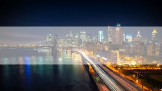 |
|
| Desktop (Extra Large) | 1920 x 600 | Widescreen (HD) | 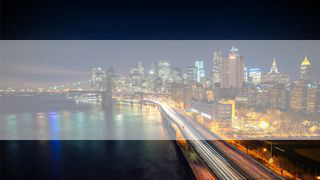 |
|
| Desktop (Large) | 1366 x 600 | Extra Large | 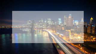 |
|
| Desktop | 1024 x 600 | Large | 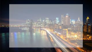 |
|
| Tablet | 640 x 580 | Large | 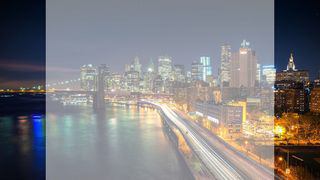 |
The Large rendition is needed here because the height is a tad bit taller than other landscape components. If this wasn’t the case and it was 480px-500px then it would scale properly without over-scaling or cropping. |
| Mobile | 320 x 200 | Small | 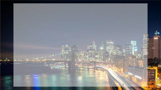 |
Background - Narrow
Narrow background applies to the background in a column.
| Breakpoint | Dimensions | Rendition | Focal Point Overlay | Notes |
|---|---|---|---|---|
| Desktop (UHD) | 3840 x 600 | 4K (UHD) | 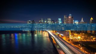 |
|
| Desktop (QHD) | 2560 x 600 | 2K (QHD) |  |
|
| Desktop (Extra Large) | 1920 x 600 | Widescreen (HD) | 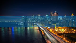 |
|
| Desktop (Large) | 1366 x 600 | Extra Large | 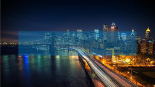 |
|
| Desktop | 1024 x 600 | Large | 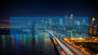 |
|
| Tablet | 640 x 580 | Large | 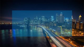 |
The Large rendition is needed here because the height is a tad bit taller than other landscape components. If this wasn’t the case and it was 480px-500px then it would scale properly without over-scaling or cropping. |
| Mobile | 320 x 200 | Small | 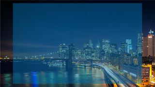 |
List - Card x3 (wide)
This applies to a set of 3 cards in a row.
| Breakpoint | Dimensions | Rendition | Focal Point Overlay | Notes |
|---|---|---|---|---|
| Desktop (Large) | 352 x 210 | Small | 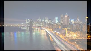 |
|
| Desktop / Tablet | 260 x 160 | Small |  |
|
| Mobile | 270 x 145 | Small |  |
List - Card x2 (wide)
This applies to a set of 2 cards in a row.
| Breakpoint | Dimensions | Rendition | Focal Point Overlay | Notes |
|---|---|---|---|---|
| Desktop (Large) | 542 x 220 | Standard (wide) | 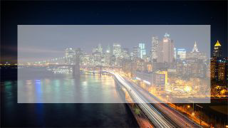 |
|
| Desktop | 400 x 160 | Standard |  |
|
| Tablet | 542 x 178 | Standard (wide) | 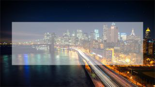 |
|
| Mobile | 288 x 154 | Small | 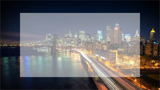 |
List - Card with Media
This applies to a set of cards that have media content.
| Breakpoint | Dimensions | Rendition | Focal Point Overlay | Notes |
|---|---|---|---|---|
| Desktop (Large) | 552 x 500 | Medium | 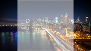 |
|
| Desktop | 414 x 435 | Medium | 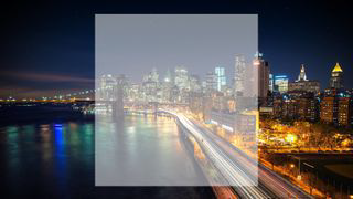 |
|
| Tablet | 540 x 300 | Standard (wide) | 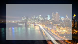 |
|
| Mobile | 288 x 150 | Small | 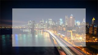 |
List - Card with Media (full width)
This applies to a set of cards that have media overlay.
| Breakpoint | Dimensions | Rendition | Focal Point Overlay | Notes |
|---|---|---|---|---|
| Desktop (Large) | 880 x 495 | Medium |  |
|
| Desktop | 660 x 370 | Medium | 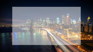 |
|
| Tablet | 542 x 335 | Standard (wide) | 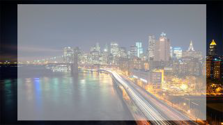 |
|
| Mobile | 270 x 170 | Small | 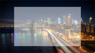 |
List - Card with Metadata
This applies to a set of cards that have metadata showing as overlay.
| Breakpoint | Dimensions | Rendition | Focal Point Overlay | Notes |
|---|---|---|---|---|
| Desktop (Large) | 700 x 495 | Medium | 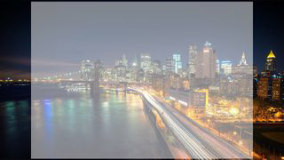 |
|
| Desktop | 550 x 370 | Medium | 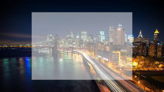 |
|
| Tablet | 500 x 280 | Standard (wide) | 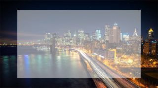 |
|
| Mobile | 260 x 162 | Small |  |
Implementation
All image renditions will be stored in DAM as physical renditions. This saves time in generating these renditions on the fly and allows authoring control when required e.g. Authors can update renditions when needed.
Additionally, when selecting images for placement where available Authors will be able to choose a type of approach for rendering available renditions. Following is the outline of rendering options for images.
Responsive: use existing renditions
A default strategy for selecting an asset is a responsive image; this gives the best experience for end-users and has least authoring overhead as no selection needed to be made. By default, the template for this rendering option has a list of all configured renditions that cover all supported devices outlined in Rendition Sizes.
<div itemscope="" itemtype="http://schema.org/ImageObject" component="true" data-layer-componentpath="article/par/contentblock4/par/image" class="image imageTitleDescription" role="banner" id="image4" data-layer-track="false" data-asset-id="5b1dc46d-858c-4b3a-b23b-5f8b6e0e6770" data-asset-trackable="true" data-asset-licensed="false" data-analytics-event-label="city3.jpg" data-analytics-metatype="image/jpeg" data-analytics-filename="/content/dam/aemdesign-showcase/en/components/media/image/city3.jpg">
   <figure>
      <picture>
         <!--[if IE 9]><video style="display: none;"><![endif]-->
         <source srcset="/content/dam/aemdesign-showcase/en/components/media/image/city3.jpg/jcr:content/renditions/cq5dam.thumbnail.48.48.png"
                media="(min-width: 1px) and (max-width: 72px)">
            <source srcset="/content/dam/aemdesign-showcase/en/components/media/image/city3.jpg/jcr:content/renditions/cq5dam.thumbnail.140.100.png"
                media="(min-width: 73px) and (max-width: 210px)">
            <source srcset="/content/dam/aemdesign-showcase/en/components/media/image/city3.jpg/jcr:content/renditions/cq5dam.thumbnail.319.319.png"
                media="(min-width: 211px) and (max-width: 478px)">
            <source srcset="/content/dam/aemdesign-showcase/en/components/media/image/city3.jpg/jcr:content/renditions/cq5dam.web.1280.1280.jpeg"
                media="(min-width: 478px)">
            <!--[if IE 9]></video><![endif]-->
            <img itemprop="contentUrl"
                src="/content/dam/aemdesign-showcase/en/components/media/image/city3.jpg/_jcr_content/renditions/cq5dam.web.1280.1280.jpeg"
                title="city3.jpg">
      </picture>
      <figcaption>
         <h4>city3.jpg</h4>
      </figcaption>
      <div class="description" itemprop="description">Image that has no title</div>
   </figure>
</div>
Manual: responsive background with custom renditions per media query
Some scenarios need for manual selection of renditions.
Following author selections allow selection of existing renditions for a specific media query, providing exceptional control to authors.
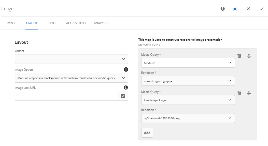
Result in generations of this picture template.
<div itemscope="" itemtype="http://schema.org/ImageObject"
    component="true" data-layer-componentpath="article/par/contentblock24/par/image"
    class="image" role="banner" id="image24" data-layer-track="false"
    data-asset-id="ecd9f9af-458e-4b28-afc2-3c14bacbedb8"
    data-asset-trackable="true" data-asset-licensed="false"
    data-analytics-event-label="aem-design.png"
    data-analytics-metatype="image/png"
    data-analytics-filename="/content/dam/aemdesign-showcase/en/common/aem-design.png">
   <picture>
      <!--[if IE 9]><video style="display: none;"><![endif]-->
      <source
         srcset="/content/dam/aemdesign-showcase/en/common/aem-design.png/jcr:content/renditions/aem-design-logo.png"
         media="(min-width: 768px)">
      <source
         srcset="/content/dam/aemdesign-showcase/en/common/aem-design.png/jcr:content/renditions/cq5dam.web.1280.1280.png"
         media="(min-width: 768px) and (orientation: landscape), screen and (min-width: 992px)">
      <!--[if IE 9]></video><![endif]-->
      <img itemprop="contentUrl"
         src="/content/dam/aemdesign-showcase/en/common/aem-design.png/_jcr_content/renditions/cq5dam.web.1280.1280.png"
         title="aem-design.png">
   </picture>
</div>
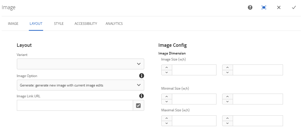
Generate: generate new image with current image edits
Existing image functionality allows some modification of the original image using the Generated Image options allows leveraging this functionality.
The resulting template contains a link to the current image path with a timestamp.
<div itemscope="" itemtype="http://schema.org/ImageObject"
    component="true" data-layer-componentpath="article/par/contentblock20/par/image"
    class="image" role="banner" id="image20" data-layer-track="false"
    data-asset-id="5b1dc46d-858c-4b3a-b23b-5f8b6e0e6770"
    data-asset-trackable="true" data-asset-licensed="false"
    data-analytics-event-label="city3.jpg"
    data-analytics-metatype="image/jpeg"
    data-analytics-filename="/content/dam/aemdesign-showcase/en/components/media/image/city3.jpg">
   <img class="img-fluid " itemprop="contentUrl"
      src="/content/dam/aemdesign-showcase/en/components/media/image/city3.jpg.img.jpeg/1586316135756.jpeg"
      title="city3.jpg">
</div>
Adaptive: generate new renditions with quality settings for each breakpoint
Adaptive image is a service that is configured with a system set fixed-list of rendition widths that can be used for image sizing. Authors either can accept the default list of mapping or specify a custom list based on system configurations.
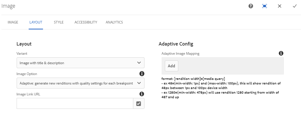
The template contains a list of all media queries and link to the asset with predefined selectors that trigger a service.
<div itemscope="" itemtype="http://schema.org/ImageObject" component="true" data-layer-componentpath="article/par/contentblock19/par/image" class="image imageTitleDescription" role="banner" id="image19" data-layer-track="false" data-asset-id="4a0c05b8-10af-439a-8e04-c56386d9618d" data-asset-trackable="true" data-asset-licensed="false" data-analytics-event-label="Asset Title" data-analytics-metatype="image/jpeg" data-analytics-filename="/content/dam/aemdesign-showcase/en/components/media/image/city2.jpg">
   <figure>
      <picture>
         <!--[if IE 9]><video style="display: none;"><![endif]-->
         <source srcset="/content/dam/aemdesign-showcase/en/components/media/image/city2.jpg.img.480.jpg"
                media="(min-width: 1px) and (max-width: 533px)">
            <source srcset="/content/dam/aemdesign-showcase/en/components/media/image/city2.jpg.img.640.jpg"
                media="(min-width: 534px) and (max-width: 691px)">
            <source srcset="/content/dam/aemdesign-showcase/en/components/media/image/city2.jpg.img.720.jpg"
                media="(min-width: 692px) and (max-width: 770px)">
            <source srcset="/content/dam/aemdesign-showcase/en/components/media/image/city2.jpg.img.800.jpg"
                media="(min-width: 771px) and (max-width: 848px)">
            <source srcset="/content/dam/aemdesign-showcase/en/components/media/image/city2.jpg.img.960.jpg"
                media="(min-width: 849px) and (max-width: 1008px)">
            <source srcset="/content/dam/aemdesign-showcase/en/components/media/image/city2.jpg.img.1024.jpg"
                media="(min-width: 1009px) and (max-width: 1075px)">
            <source srcset="/content/dam/aemdesign-showcase/en/components/media/image/city2.jpg.img.1280.jpg"
                media="(min-width: 1076px) and (max-width: 1331px)">
            <source srcset="/content/dam/aemdesign-showcase/en/components/media/image/city2.jpg.img.1440.jpg"
                media="(min-width: 1332px) and (max-width: 1572px)">
            <source srcset="/content/dam/aemdesign-showcase/en/components/media/image/city2.jpg.img.1920.jpg"
                media="(min-width: 1573px) and (max-width: 1971px)">
            <source srcset="/content/dam/aemdesign-showcase/en/components/media/image/city2.jpg.img.2048.jpg"
                media="(min-width: 1971px)">
            <!--[if IE 9]></video><![endif]-->
            <img itemprop="contentUrl"
                src="/content/dam/aemdesign-showcase/en/components/media/image/city2.jpg.img.2048.jpg"
                alt="Asset Headline" title="Asset Title">
      </picture>
      <figcaption>
         <h4>Asset Title</h4>
      </figcaption>
      <div class="description" itemprop="description">Asset Description</div>
   </figure>
</div>
Rendition: pick suitable image rendition
Some scenarios require the selection of a specific rendition based on a set width of and asset.
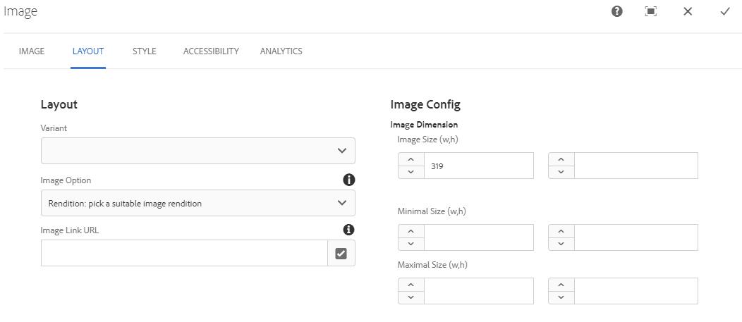
This template only contains the image that was matched based on the specified width.
<div itemscope="" itemtype="http://schema.org/ImageObject"
    component="true" data-layer-componentpath="article/par/contentblock17/par/image"
    class="image" role="banner" id="image17" data-layer-track="false"
    data-asset-id="5b1dc46d-858c-4b3a-b23b-5f8b6e0e6770"
    data-asset-trackable="true" data-asset-licensed="false"
    data-analytics-event-label="city3.jpg"
    data-analytics-metatype="image/jpeg"
    data-analytics-filename="/content/dam/aemdesign-showcase/en/components/media/image/city3.jpg">
   <img class="img-fluid " itemprop="contentUrl" src="/content/dam/aemdesign-showcase/en/components/media/image/city3.jpg/_jcr_content/renditions/cq5dam.thumbnail.319.319.png" title="city3.jpg">
</div>
We hope these image conventions will help you design a much more robust Design Language System that will ensure the author will fully leverage the power of AEM.
If you want to check out these image conventions in actions start by running AEM container, you can find how to get started here: docker-aem-bundle, once you have a docker container running head over to showcase to checkout Image Component.
Once again if you need help reach out to us, we will be happy to help.
Leave a Comment