
Delivery Guide
Components
Components are the basic building blocks in AEM. When designing components two aspects must be considered, experience and presentation. Experience will help to understand out how the component is used by authors, how it is linked to content within CMS and how it will be used by the end user. Presentation will help to understand the presentation of the component in different content contexts (on its own, in admin view, in a list), its integration into front end frameworks and its indirect interaction with other components (on same page, across pages, across sessions).
It is important to keep the component’s (authoring) experience simple and separate from the presentation:
-
Mixing presentation behaviour with authoring experience will complicate the component’s design. For example, the frameworks used for presentation may introduce incompatibilities with the authoring environment.
-
Mixing presentation behaviour with authoring experience would introduce additional ways of authoring for the content authors.
-
The presentation will (and should) change more rapidly than the authoring experience.
Experience
Component presentation is divided into two primary dialogs, Content Dialog and Design Dialog. Content Dialog is also known as “Dialog” and refers to the interface an Author uses to input content for component. When an Author uses the Content Dialog to input content they are providing actual Content, Layout and Style values for that instance of the component on a page. Design Dialog on the other hand is used to configure the Default Content for the component instance within a Page Template. This allows for creating default Style configuration and possible content Placeholders for component Presentation. This enables a default Component Layout that matches a Style Guide and that does not require initial Style input per each component placed on pages by the authors.
Presentation
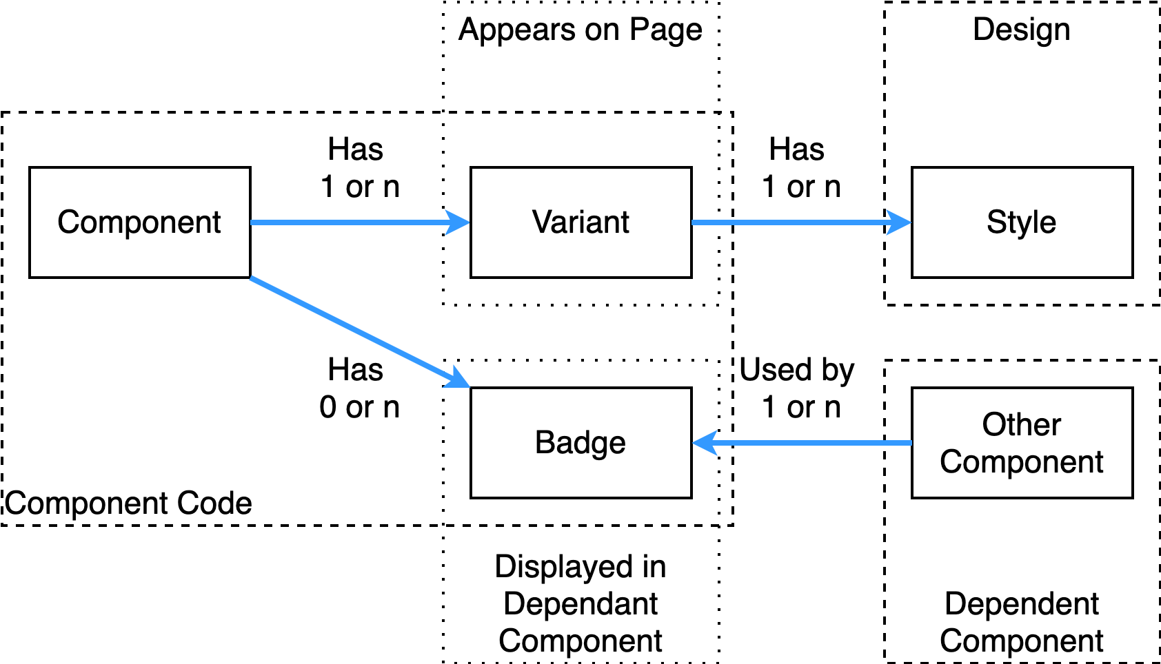
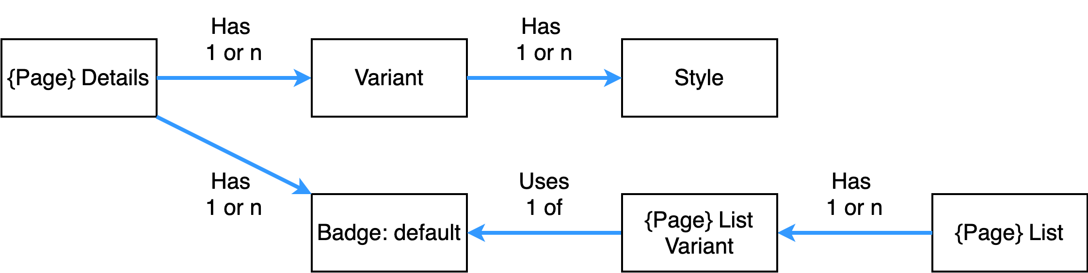
Component presentation should be broken down to two main areas: Variants and Badges. Variants is an output of components content on a Page, Badges is an output of the components content in a List Component. This means that if component is not going to be used in a List component it should not have any Badges. All components will have a Default Variant that will be used by default that component is placed on a page.
Variants for a component display content, so each Variant should have different content output, Title for the Variant should also be representative of the Content that the Variant uses, this makes it easier to teach Authors. Each variant will have a Default Style and other styles that will be created over time.
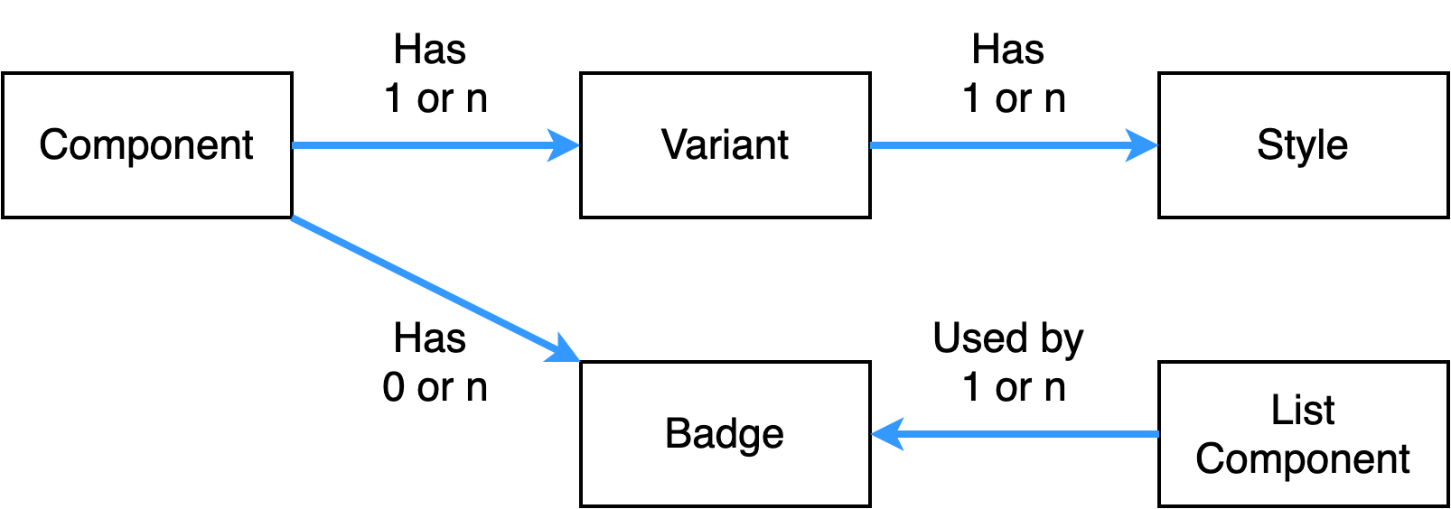
This breakdown enables ability to update the Look And Feel of component without having to update the component code.
Concept: Component to Design/Style Relationship
This concept allows few components that can be authored in unlimited layouts to create the end experience.
Concept: Details and List
Details is about providing a place holder for a placeholder for structure content
List is about proving a placeholder for display of content in a list
Component Categories
It’s important that each component is understood from its CMS perspective, this planning for a component should start from inception of component, before its development has started. Keeping component isolated into their CMS functional groups is important as its keeps the component library organised and it fundamentally defines the component expected behaviour.
Here are initial list of CMS Functional Groups for components:
- Content - primary components used to store authored content, content from these components is used by other components for display
- Layout - provide layout ability, grouping and structuring of content, contain layout and style related content
- List - find content and show data in listing, contain layout and style related content
- Details - used to create and display custom metadata for different page types
- Widgets - used to provide client-side functionality, integrating 3rd party services
- Commerce - used for eComponents, shopping carts, checkouts, product listing etc
- Common - used for shared components that are available to authors
- Forms - used to contain all the components that are used in forms
- Template - used to store all the available Template components that contain HTML page structures
- Media - Assets related component, galleries, asset lists, videos etc
- Workflow - steps that appear in workflow editor
NOTE: Adding new items to this list should be communicated and designed thoroughly, as these groups reflect and relate to CMS functions
Sling Selectors
Apache Sling is at the core of AEM, it enables all the authoring and content serving functions. Here is the high level overview of the framework:
- REST based web framework
- Content-driven, using a JCR content repository
- Powered by OSGi
- Scripting inside, multiple languages (JSP, server-side javascript, Scala, etc.)
- Apache Open Source project
Sling selectors should be used to pass parameters specific to rendering and not content filtering. (reference)
If selectors are used for content filtering, then you are allowing unlimited number of URLs for a particular piece of content. This opens up opportunity for DDOS attacks in two ways:
- Attackers can flooding the Publishers with content requests using bogus selector values, making the publishers unable to serve legitimate requests.
- Attackers can overload the Dispatchers’ filesystem with cached files generated from bogus selector requests.
Content Modelling
At best content authored should be located either below current page being authored or be on the page. Situation where you require content located outside current page and its descendants should be kept to a minimum, as OOB functionality only detect relationships between Tags and Assets. This plays a primary role when activating and deactivating content pages, to detect indirect relationships additions code will need to be written.
Content Segmentation
Following is a list of types of path segmentation’s that should be applied when creating content architectures in a CMS.
| Pattern | Description | Examples |
|---|---|---|
| By Site | Content should be segregated by sites first, this allows simple management and can be easily secured | /content/site/.. /content/site-showcase/.. /content/dam/site/.. /content/projects/site/.. |
| By Language | Content should be segregated into Language Locale subfolder so that it can be translated into appropriate language | /content/site/en/.. /content/site/ru/.. |
| By Date Range | Any content that is generated over time and has a long life should be segregated into date range Hierarchy YYYY/MM/DD. Day is optional and should be omitted if no more than 200 assets are added per day, if more than 200 items required then additional segmentation should be used, either HH or functional grouping, which segments content in an even manner | /content/site/en/news/{year}/{month}/title /content/site/en/news/{yyyy}/{mm}/{dd}/title |
| By Functional Group | Content at any level should be grouped into functional groups that make sense to the Authors when searching content manually. eg. Banners, Advertising, Posters, Portraits | /content/dam/site/assets/accounts/.. /content/dam/site/assets/designers/.. |
| By Content Collection | Where possible when Assets belong to a group/set/collection they should be segregated into Collections, for example uploading a set of images that will be used in a Photo Gallery they should be placed into a folder describing the Collection | /content/dam/site/galleries/collection/.. /content/dam/site/videos/collection/.. |
| Content Metadata | Content must have at least a legible Title, Description and Tags assigned when being added | /content/site/en/specials {title: Specials } /content/site/en/corporate {title: Corporate} |
| Content Tagging | Content must be tagged to describe its nature, this helps in ability for Authors to find this content. One must not rely on content structure to find content, free text search should be considered first | /content/site/en/specials {tag: Products} /content/site/en/corporate {tag: Corporate} |
Segmentation Reference
Pages
Sample hierarchy for Page tree
- Content Root
- Site Root
- Language
- Section
- Sub-Section
- Content
- Sub Content
- …n
- Sub Content
- Content
- Sub-Section
- Section
- Language
- Site Root
Assets
Sample hierarchy for Assets tree
- Content Root
- Site Root
- Language
- Section
- Category
- Asset
- Category
- Section
- Language
- Site Root
Tags
Sample hierarchy for Tags tree
- Content
- Tags Root
- Namespace
- Category
- Group
- Tag
- Group
- Category
- Namespace
- Tags Root
Component Templating
These are several methods that can be employed to create templates for components. The most basic method is to use simple HTML fragments that can be kept in separate JSP files and included using logic that relies on content input into the component. This practice allows for simple authoring and maintenance mechanism whereby Frontend Designers can participate in updates of component HTML structure. This collaborative activities create agility and does not require continued developer effort.
HTL Templates
In AEM 6 a new templating engine called Sightly/HTL has been introduced that aligns better with the design practices and development efforts. It is based on JSTL and has been tailored specifically around component templating and content structures. It provides a familiar HTML syntax with Templating variable conventions similar to JSTL and other Javascript frameworks.
Leave a Comment