
Code Conventions
Philosophy for Conventions
Philosophy of AEM.Design is to empower all developers (FED/BED) to be able to achieve more without having to learn a lot more initially. This means that focus changes to providing a simplified and specific experience that allows continuous learning of AEM and framework features. As more knowledge is gained and existing structures are understood, developers can start update structures as needed.
Major principles that should be considered as you start learning
- Emphases on Content - ensure that as much structure that required is converted into the content so that its changeable post-deployment, this is following Davids #1 Rule.
- Abstract AEM Knowledge - generalise and abstract AEM specific knowledge into patterns that other developers can use without immediately needing to understand underlying principles.
- Component Grouping and Naming - components should be named concerning their content and AEM purpose, and not about their end-use, see more details in Component Grouping and Naming.
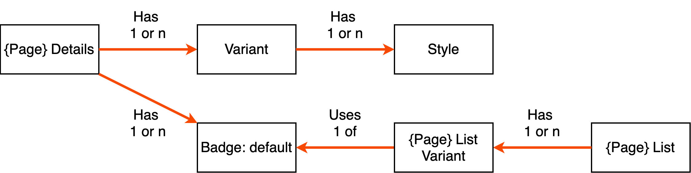
- Component Variants and Badges - ability to represent different structures of component content without having to resort to using CSS to hide available content; see more details in Component Variants and Badges.
- Tags Usage - tags in AEM are specifically made to provide a mechanism to create a taxonomy of keywords that allow linking of content together. This capability is beneficial to represent Design Language keywords that contain styling nomenclature.
Component Grouping and Naming
All components used by authors without exception must be located in their designated component group folders.
components
    layout (component group)
        article
This structure will ensure that their components are organised and quickly found, additionally grouping provides a segmentation structure that will allow component numbers scale without creating a mess in one folder.
Following is the list of name that should be used for making component groups
| Group | Name | Description |
|---|---|---|
| Analytics | analytics | components for analytics use |
| Media | media | assets related components, galleries, asset lists, videos etc |
| Content | content | primary components used to store authored content, content from these components is used by other components for display |
| Cloud Services | cloudservices | components for cloud services |
| Layout | layout | provide layout ability, grouping and structuring of content, contains layout related components |
| List | list | find pages and show their data in lists |
| Details | details | used to create and display custom metadata for different page types |
| Widgets | widgets | used to provide client-side functionality, integrating 3rd party services |
| Commerce | commerce | used for Commerce, shopping carts, checkouts, product listing etc. |
| Common | common | used for shared components that are available to authors |
| Forms | forms | used to contain all the components that are used in forms |
| Template | template | used to store all the available Template components that include HTML page structures that are used as a base for authorable templates |
| Workflow | workflow | steps that appear in workflow editor |
Groups are targeted to be meaningful to Authors when creating new groups consider how to explain component groups to authors.
Component Variants and Badges
Component Variants are used as a pattern to output different HTML templates for the same component content.
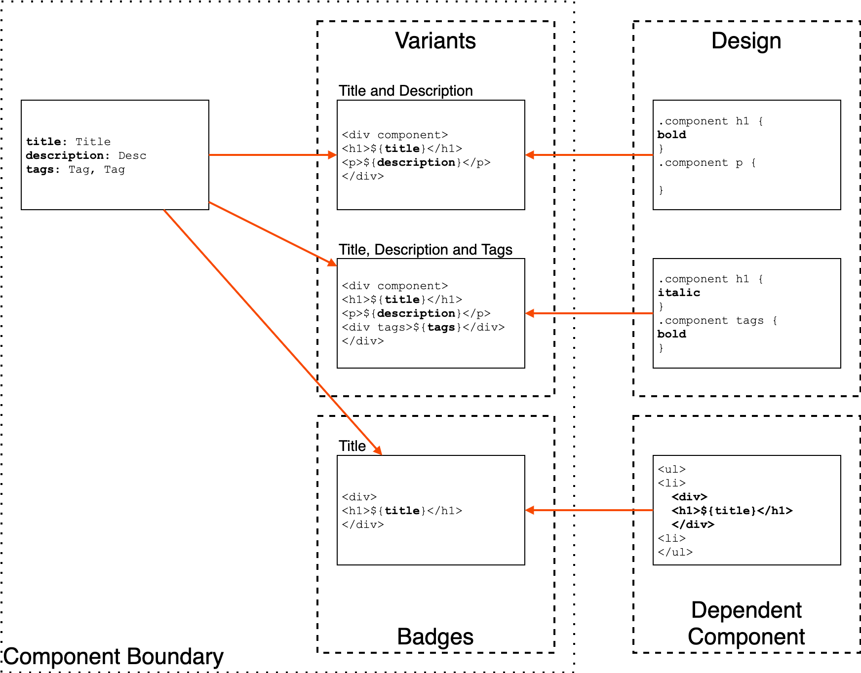
Every component will have unique fields that are used by authors for content input. Usually, these fields will be tied to a specific visual representation of that content. There are scenarios where you need to be able to output different HTML structure of a component data, to achieve Component Variant pattern is used.
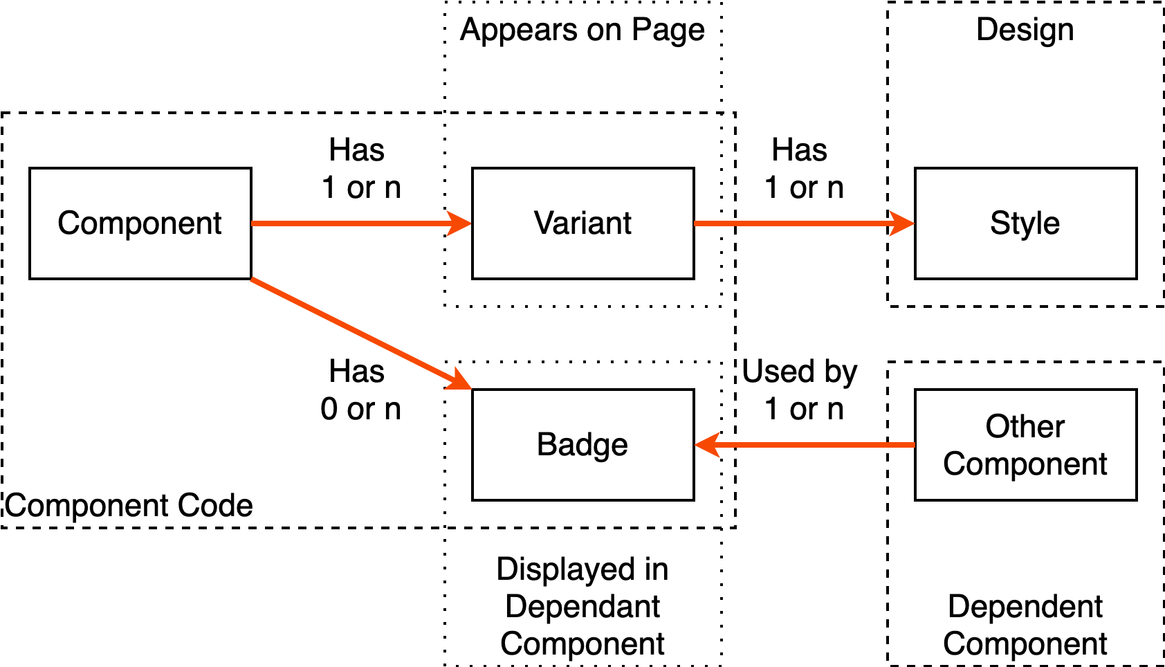
Each component should have at least one default Variant, and component template should provide a content-driven approach to loading new Variants see HTL Component Template for example. This allows authors to choose from a dropdown list which variant they require.
Additionally Component Variants concepts are applied as a convention to allow a component to control the display of its content in related components. This Variants concept provides a method of describing target output structures that are structured from component fields. This pattern offers a way to remove dependencies of one component on the structure of another component.
If a component needs to leverage the content of another component it used Sling selectors to call component with a specific badge name. This also allows abstracting all of the structure into content and create an Author controlled presentation pattern.
Component Structure
All component must follow consistent patterns that help everyone to understand consistency across components. Following are the conventions that are used for components.
| Node | Purpouse | Usercase | Extension |
|---|---|---|---|
| _cq_design_dalog | Authoring dialog that will be used to configure component | mandatory | xml |
| _cq_design | Primary Authoring fo interacting with component properties | mandatory | xml |
| .content.xml | component authoring metadata | mandatory | xml |
| _cq_editConfig.xml | component authoring configuration for Editor UI | mandatory | xml |
| README.md | readme describing the component which is viewed in the Components Experience in AEM | mandatory | md |
| variant.default. |
default template for display | mandatory | jsp,html |
| component. |
default boostrap of component | mandatory | jsp,html |
| badge.default. |
default badge to be used by other components for representing current component content | optional | jsp,html |
Component Client Libs Namespace Convention
Components that have specific clientlibs should have following client libs assigned if they will be loaded by clientlibs in template footer and headers.
Paths of component namespace should be following the location of the component path eg
| Namespace | Purpose |
|---|---|
| specifies that this component library should be loaded into global authoring clientlibs | |
| specifies that this component library should be loaded into global publish clientlibs | |
| specific group for the component to be used for specific usage such as component loading its own client libs |
Component Versioning
Initially, when a component is created, it’s acceptable to have the component code to be located under its folder path.
components
    layout
        article
            <component structure>
Where possible initial component structure should be located in the v1 subfolder, this will also ensure that the evolution of component will require marginally less effort.
components
    layout
        article ( sling:resourceSuperType -> v1/article )
            v1
                <component structure>
As component version grow, root component should be pointed to the specific version all existing references of component should be using. Not doing this will mean that your content pages will have hard references to component version without any Authoring way of changing that apart from reauthoring the content.
components
    layout
        article ( sling:resourceSuperType -> v2/article )
            v1
                article
            v2
                article
This will ensure that all existing pages will continue working as expected and will provide a natural upgrade for all component locations. This pattern will also minimise presenting component versions to Authors as there is no simple way to describe difference to authors when they are editing.
Component Client Libs Modules
Component generic client libs should be located in the component folder.
components
    layout
        article
            clientlibs (version agnostic client libs)
                css/
                js/
                css.txt
                js.txt
            v1
                article
                clientlibs (version specific client libs)
                <component structure>
            v2
                article
                clientlibs (version specific client libs)
                <component structure>
JSP Component Template
For ease of understanding component code following sections should be used as reference.
| LABEL | Description |
|---|---|
| ** COMPONENT DEPENDECIES ** | used for describing dependecies |
| ** COMPONENT DECLARATIONS ** | |
| ** COMPONENT LOGIC ** | |
| ** COMPONENT TEMPLATING ** |
Following is a sample for component bootrstap, please remove annotations when using as a template.
*** COMPONENT DEPENDECIES ***
<%@ page import="com.google.common.base.Throwables" %>
<%@ include file="/apps/aemdesign/global/global.jsp" %>
<%@ include file="/apps/aemdesign/global/images.jsp" %>
<%@ include file="/apps/aemdesign/global/components.jsp" %>
<%
*** COMPONENT DECLARATIONS ***

    final String DEFAULT_ARIA_ROLE = "article";

    // {
    //   1 required - property name,
    //   2 required - default value,
    //   3 optional - name of component attribute to add value into
    //   4 optional - canonical name of class for handling multivalues, String or Tag
    // }
    Object[][] componentFields = {
        {FIELD_ARIA_ROLE,DEFAULT_ARIA_ROLE, DEFAULT_ARIA_ROLE_ATTRIBUTE},
        {FIELD_VARIANT, DEFAULT_VARIANT},
    };

    ComponentProperties componentProperties = getComponentProperties(
            pageContext,
            componentFields,
            DEFAULT_FIELDS_STYLE,
            DEFAULT_FIELDS_ACCESSIBILITY);

*** COMPONENT LOGIC ***
    componentProperties.put(DEFAULT_BACKGROUND_IMAGE_NODE_NAME,getBackgroundImageRenditions(pageContext));

%>
*** COMPONENT TEMPLATING ***
<c:set var="componentProperties" value="<%= componentProperties %>"/>
<%@ include file="/apps/aemdesign/global/component-background.jsp" %>
<c:choose>
    <c:when test="${componentProperties.variant eq DEFAULT_VARIANT}">
        <%@ include file="variant.default.jsp" %>
    </c:when>
    <c:otherwise>
        <%@ include file="variant.default.jsp" %>
    </c:otherwise>
</c:choose>
<%@include file="/apps/aemdesign/global/component-badge.jsp" %>
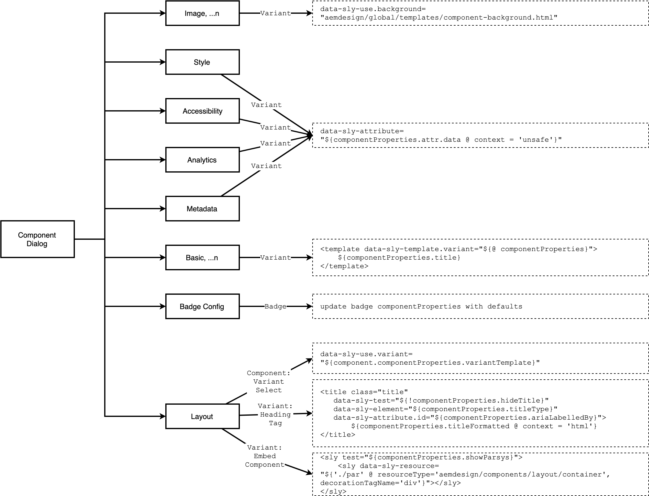
HTL Component Template
Following is a sample for component bootrstap
<sly data-sly-use.component="design.aem.models.v2.layout.Article"
     data-sly-use.variant="${component.componentProperties.variantTemplate}"
     data-sly-use.background="aemdesign/global/templates/component-background.html"
     data-sly-use.info="aemdesign/global/templates/component-info.html">

    <!--/* print component background */-->
    <sly data-sly-call="${background.variant @ componentId=component.componentProperties.componentId, assets=component.componentProperties.bgimage.componentBackgroundAssets}"></sly>

    <!--/* print component variant */-->
    <sly data-sly-call="${variant.variant @ componentProperties=component.componentProperties}"></sly>

    <!--/* print component info in edit mode */-->
    <sly data-sly-call="${info.variant @ componentProperties=component.componentProperties, component=component}"></sly>

</sly>
HTL Component WCMUsePojo Class
Following is a reference for component Class that will be backing each HTL component.
package design.aem.models.v2.details;

import com.adobe.cq.sightly.WCMUsePojo;
import design.aem.components.ComponentProperties;
import design.aem.utils.components.TagUtil;
import com.day.cq.i18n.I18n;
import org.slf4j.Logger;
import org.slf4j.LoggerFactory;

public class PageDetails extends WCMUsePojo {

    private static final Logger LOGGER = LoggerFactory.getLogger(PageDetails.class);

    private ComponentProperties componentProperties = null;
    public ComponentProperties getComponentProperties() {
        return this.componentProperties;
    }

    @Override
    public void activate() throws Exception {

        com.day.cq.i18n.I18n _i18n = new I18n(getRequest());

        //COMPONENT STYLES
        // {
        //   1 required - property name,
        //   2 required - default value,
        //   3 optional - name of component attribute to add value into
        //   4 optional - canonical name of class for handling multivalues, String or Tag
        // }
        Object[][] componentFields = {
            {FIELD_VARIANT, DEFAULT_VARIANT},
        };
        componentProperties = ComponentsUtil.getComponentProperties(
            this,
            componentFields,
            DEFAULT_FIELDS_STYLE,
            DEFAULT_FIELDS_ACCESSIBILITY,
            DEFAULT_FIELDS_ANALYTICS
        );

    }
}
ClientLibs Convention - JavaScript
When writing component-specific API code in Javascript please ensure you encapsulating namespacing, that does not directly depend on external dependencies.
JavaScript for all Component JavaScript code must be divided into:
- functions.js - component functions API, has all of the required static utility functions that will be used by component behaviours. These should only be functions and should not be binding to elements of the page on load events.
- behaviour.js - component binding API, has all of the load events and binding to HTML, uses functions to help with structure and reusable config as required. This is the file that demonstrates how the component is attached to HTML markup.
JS modules should be located as following.
components
    layout
        article
            clientlibs (version agnostic client libs)
                css/
                js/
                    functions.js
                    behaviour.js
                css.txt
                js.txt
Following is an example of a function used for component.
//search - functions
window.AEMDESIGN = window.AEMDESIGN || {"jQuery":{}};
window.AEMDESIGN.components = AEMDESIGN.components || {};
window.AEMDESIGN.components.search = AEMDESIGN.components.search || {};

(function ($, _, ko, log, utils, ns, window, undefined) { //NOSONAR convention for wrapping all modules

    "use strict";
    var _version = "0.1";

    ns.version = function () {
        return _version;
    };

    ns.init = function($el) {
        //INIT CODE
    };

})(AEMDESIGN.jQuery,_,ko, AEMDESIGN.log, AEMDESIGN.utils, AEMDESIGN.components.search, this);
Following is an example of behaviours used for component.
//search - behaviour
window.AEMDESIGN = window.AEMDESIGN || {"jQuery":{}};
window.AEMDESIGN.components = AEMDESIGN.components || {};
window.AEMDESIGN.components.search = AEMDESIGN.components.search || {};

(function ($, _, ko, utils, log, search, window, undefined) { //NOSONAR convention for wrapping all modules

    $(document).ready(function () {

        $("[data-modules*='search']").each(function() {

            var base = $(this);

            search.init(base);


        });


    });

})(AEMDESIGN.jQuery, _, ko, AEMDESIGN.utils, AEMDESIGN.log, AEMDESIGN.components.search, this); //pass in additional dependencies
ClientLibs Convention - CSS
When writing CSS ensure that component Styles are added under a component namespace. Here is an example
[component] .<component name> {
}
Dialog Conventions
Common Tabs for all component - use shared dialogs.
<styleTab
    jcr:primaryType="nt:unstructured"
    jcr:title="Style"
    path="/apps/aemdesign/global/dialog/touch/style/content/items/styleTab"
    resourceType="granite/ui/components/foundation/section"
    sling:resourceType="granite/ui/components/coral/foundation/include"/>
Use Tags as a source for your Dropdowns - will ensure that content can be updated later.
<cancelinheritparent
    jcr:primaryType="nt:unstructured"
    sling:resourceType="granite/ui/components/coral/foundation/form/select"
    fieldLabel="Cancel Inherit Parent"
    name="./cancelInheritParent"
    emptyOption="{Boolean}true"
    value="">
    <datasource
        jcr:primaryType="nt:unstructured"
        sling:resourceType="aemdesign/components/coral/datasources/tags"
        variant="valuelist"
        path="/content/cq:tags/${(empty tenant.id and empty tenantId) ? 'aemdesign' : (empty tenant.id ? tenantId : tenant.id )}/component-dialog/common/true-false"/>
</cancelinheritparent>
Don’t use Checkbox fields in dialogs - use Dropdowns so that it’s clear what if the user has made a selection and what defaults are
<cancelinheritparent
    jcr:primaryType="nt:unstructured"
    sling:resourceType="granite/ui/components/coral/foundation/form/select"
    fieldLabel="Cancel Inherit Parent"
    name="./cancelInheritParent"
    emptyOption="{Boolean}true"
    value="">
...
</cancelinheritparent>
Common Component Field Spec - define component fields in an array to use with component helper function ComponentsUtil.getComponentProperties
Object[][] componentFields = {
    {"author", pageAuthorFullName},
    {"authorUrl", pageAuthorEmail},
    {FIELD_VARIANT, DEFAULT_VARIANT}
};
Common Component Field Load - this will collect and construct all fields with defaults and select Design/Policy config as defaults.
componentProperties = ComponentsUtil.getComponentProperties(
    this,
    componentFields,
    DEFAULT_FIELDS_STYLE,
    DEFAULT_FIELDS_ACCESSIBILITY);
Common Component Field Presets - use globally defined fields spect to collect content from shared tabs in dialog
For Styles Tabs and Common Fields
//COMPONENT STYLES
// {
//   1 required - property name,
//   2 required - default value,
//   3 optional - name of component attribute to add value into
//   4 optional - canonical name of class for handling multivalues, String or Tag
// }
public static final Object[][] DEFAULT_FIELDS_STYLE = {
    {FIELD_STYLE_COMPONENT_ID, "", "id"},
    {FIELD_STYLE_COMPONENT_THEME, new String[]{}, "class", Tag.class.getCanonicalName()},
    {FIELD_STYLE_COMPONENT_MODIFIERS, new String[]{}, "class", Tag.class.getCanonicalName()},
    {FIELD_STYLE_COMPONENT_MODULES, new String[]{}, "data-modules", Tag.class.getCanonicalName()},
    {FIELD_STYLE_COMPONENT_CHEVRON, new String[]{}, "class", Tag.class.getCanonicalName()},
    {FIELD_STYLE_COMPONENT_ICON, new String[]{}, "class", Tag.class.getCanonicalName()},
    {FIELD_STYLE_COMPONENT_POSITIONX, "", "x"},
    {FIELD_STYLE_COMPONENT_POSITIONY, "", "y"},
    {FIELD_STYLE_COMPONENT_WIDTH, "", "width"},
    {FIELD_STYLE_COMPONENT_HEIGHT, "", "height"},
    {FIELD_STYLE_COMPONENT_SITETHEMECATEGORY, ""},
    {FIELD_STYLE_COMPONENT_SITETHEMECOLOR, ""},
    {FIELD_STYLE_COMPONENT_SITETITLECOLOR, ""},
    {FIELD_STYLE_COMPONENT_BOOLEANATTR, new String[]{}, " ", Tag.class.getCanonicalName()}, //#3" " =do not store content in data attributes
    {FIELD_STYLE_COMPONENT_ANIMATION_ENABLED, false},
    {FIELD_STYLE_COMPONENT_ANIMATION_NAME, StringUtils.EMPTY, "data-aos"},
    {FIELD_STYLE_COMPONENT_ANIMATION_ONCE, StringUtils.EMPTY, "data-aos-once"},
    {FIELD_STYLE_COMPONENT_ANIMATION_EASING, StringUtils.EMPTY, "data-aos-easing"},
    {FIELD_STYLE_COMPONENT_ANIMATION_DELAY, StringUtils.EMPTY, "data-aos-delay"},
    {FIELD_STYLE_COMPONENT_ANIMATION_DURATION, StringUtils.EMPTY, "data-aos-duration"},
};
Dialog Layout
Consistent dialog pattern allow ease of understanding and experience of developing, using and training components to Authors.
Component Artifacts Alignment
All components must have a matching artifact in related artifacts. This is to ensure consistency and completeness of component delivery.
Using Tags for Styles
One of the main objectives of AEM.Design is to provide a consistent way of representing Design Languages as a taxonomy of Tags. This provides a mechanism to create Tags taxonomy by designers and then applied to components by authors.
The following image demonstrates the shared Style dialog that is applied to all components.
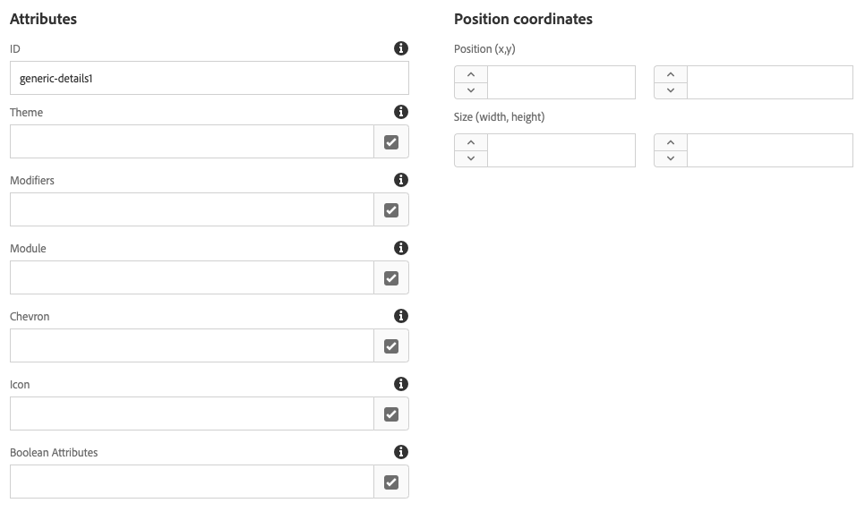
Following table describes each available option. Each of the options is defined in a way to be able to easily apply to Design Systems and so that it can be easily understood by Authors.
| Field | Type | Description |
|---|---|---|
| ID | text | generates an Id attribute for a component |
| Theme | tags | used to apply style one or a combination of nested components |
| Modifiers | tags | used to apply design system tweaks to components |
| Module | tags | used to apply behaviour to component |
| Chevron | tags | used to apply Chevron to a component |
| Icon | tags | used to apply Icon to the component |
| Boolean Attributes | tags | used to apply metadata attributes |
| Positions | text | used by Modules for placement of component in parent e.g. Tooltips |
| Size | text | used to add width and height attributes to component |
All text fields provide direct input that is added to the component wrapper. All Tag fields allow selecting multiple tags for each filed, which enables flexibility when applying styles.
Technically a component wrapper tag is trying to create the following footprint and it automated by using shared dialogs. This is reference output of share libraries to provide a consistent wrapper for all components.
<div component id="${componentProperties.id}"
    class="${componentProperties.name} ${componentProperties.theme} ${componentProperties.modifier} ${componentProperties.chevron} ${componentProperties.icon}"
    style="width:${componentProperties.width};height:${componentProperties.height};"
    x="${componentProperties.x}" y="${componentProperties.y}"
    data-modules="${componentProperties.modules}"
    ${componentProperties.booleanAttributes}></div>
Furthermore using Tags allows storing style related content in a central place which can be updated by authors, using tags also has a benefit of translations and ability to change the actual value of tag class by updating tag entry.
These updates to tag authoring UI enable updating and adding values that correspond to CSS names in authoring UI.
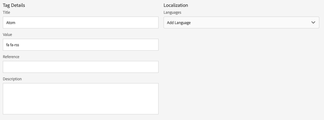
Style Tags Content Generator
Compose project contains all of the CSS, JS and Tag YAML files that describe design being developed. This subproject is compiled and installed into AEM as a standalone package. Tag YAML files is used to specify design language mapping to CSS classes, and during compiling Tags content is generated.
A custom Content Generator is used to generate Tags from YAML file similar to flowing.
content/_cq_tags/aemdesign/component-style-icon: &component-style-icon
  feed/atom:
    flat: true
    prefix: 'fa fa-rss'
    title: 'Atom'

  feed/rss:
    flat: true
    prefix: 'fa fa-rss'
    title: 'RSS'

  social:
    prefixes:
      - facebook
      - facebook-f
      - instagram
      - linkedin
      - linkedin-in
      - pinterest-p
      - tumblr
      - tumblr-square
      - twitter
      - youtube
    valueFormat: fab fa-%%prefix%%
    title: '%%prefix_normalised%%'
Reference Tag YAML files can be found in your Componse project and will be located in the Compose content-generator/config/core folder if you have generated using the AEM.Design Archetype.
Leave a Comment